
The Evolution of Logos—and What It Says About Branding Today
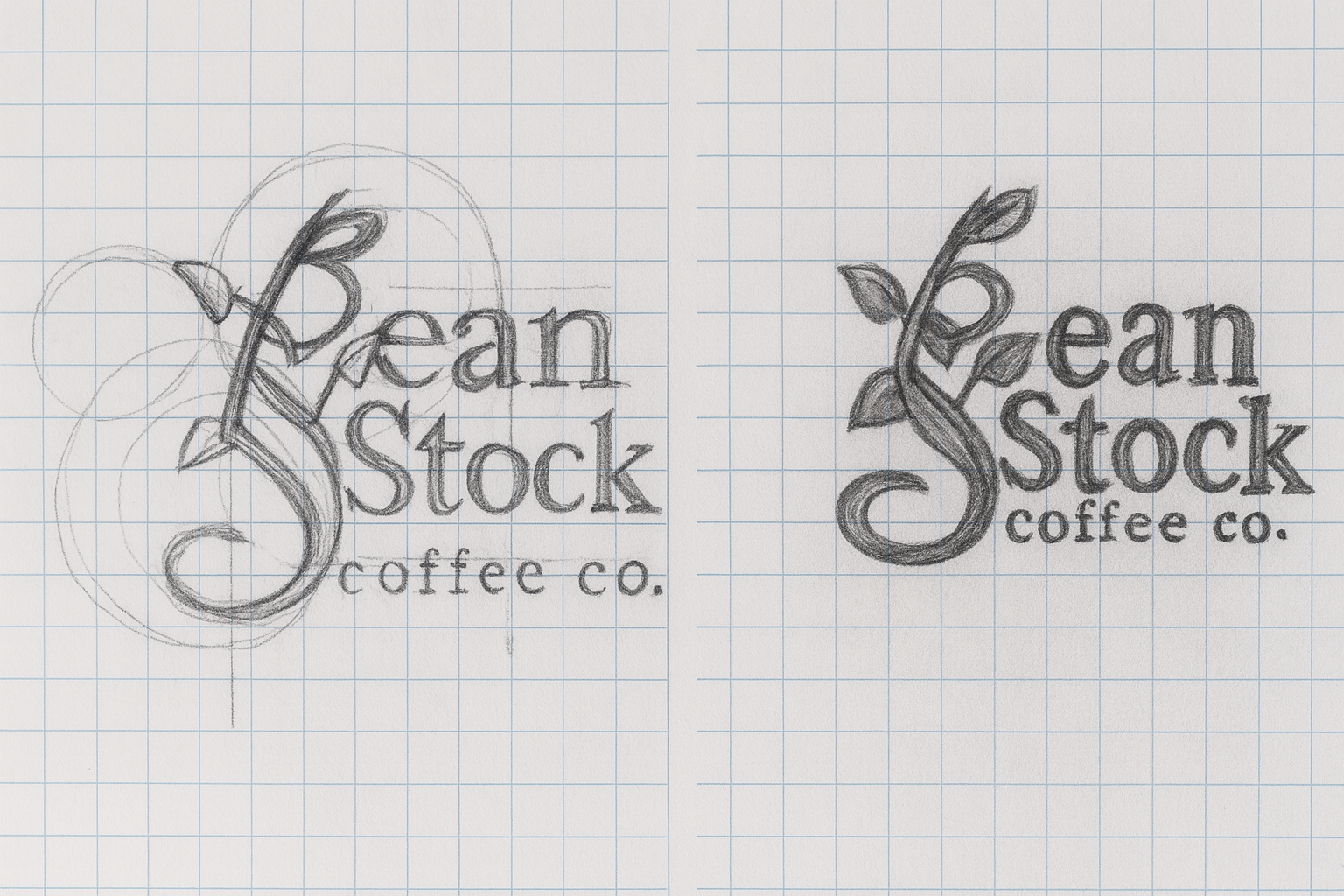
Bean Stalk Coffee Co. logo concepting
Starbucks logo evolution
Walk into almost any city in the world and you’ll see that familiar green circle staring back at you. The Starbucks logo is one of the most recognizable in modern branding, but its journey over the past five decades says a lot about where logos—and brands themselves—are headed. And maybe, why they’ve lost some of the humanity that once connected them to their customer base.
From Siren to Simplicity
When Starbucks opened in 1971, their logo looked nothing like the streamlined mark we know today. The original featured a detailed, woodcut-style siren—an earthy, nautical nod to the coffee’s seafaring origins.
Over the years, the siren became more modest, simplified, and enclosed in a clean green ring that read “Starbucks Coffee.” This logo wasn’t just an icon; it was a banner. It told you what the brand was about.
Then in 2011, Starbucks dropped the words entirely. No “coffee.” No “tea.” Just the siren. The idea was that Starbucks was no longer just a coffee shop—it was a lifestyle brand. But in removing context, the logo also shed some of the relatability that grounded it.
Why All the Simplification?
Starbucks isn’t alone here. Many brands are moving toward stripped-down logos: Cracker Barrel, Warner Bros., Pepsi, and countless others. The reason is obvious: clean logos scale better in digital spaces. They work as app icons, profile pictures, and favicons. They’re “modern” and “timeless.”
But there’s a catch: in polishing logos down to their simplest forms, brands risk sanding away the texture, history, and character that gave them soul.
When Customers Push Back: The Cracker Barrel Example
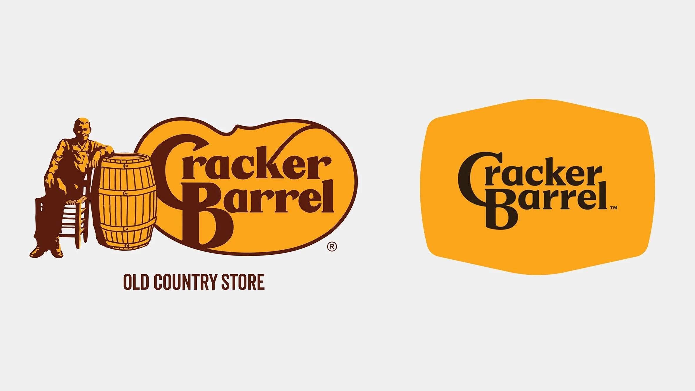
Old vs. new Cracker Barrel logo
Cracker Barrel learned this the hard way. When they attempted to modernize and flatten their logo, customers revolted. Fans felt the new version abandoned the brand’s heritage—its rustic charm, its Americana roots, its sense of nostalgia.
The backlash was so strong that Cracker Barrel was forced to reverse course and restore key elements of their old identity. That reaction was telling: people don’t always want “clean.” They want warmth. They want to see the story. They want to recognize the brand they grew up with.
Brands With Story Still Win
At Buzz & Bloom Media, we’ve seen firsthand how much people crave identity and storytelling in design. Even in our conceptual coffee shop projects, the ones that resonate most are rooted in story:
Fossil Fuel Coffee Co. — Inspired by a local shop opening in an old gas station. The bold name and prehistoric logo captured grit, humor, and memorability.
Bean Stock Coffee Co. — A whimsical, fairytale-inspired brand with full logo design, brand identity, and packaging. The playful word twist on “stalk” versus “stock” turned a classic tale into a modern coffee concept.
Neither of these concepts are “plain” or “bland.” They’re memorable because they plug directly into story, history, and play. That’s what today’s customers connect with—brands that feel alive, not sterile.
The Bigger Problem: Can CEOs Still Relate?
When Starbucks removed “coffee” from its logo, it wasn’t just about design—it was about ambition. But as brands chase global identity, they can lose touch with their core communities.
It raises a bigger question: How can CEOs who live in boardrooms and speak in investor reports truly relate to the customer who just wants a cup of coffee before work?
Logos are mirrors of leadership priorities. Early logos mirrored scrappy beginnings and authentic storytelling. Today’s simplified logos mirror scale, growth, and a desire to be everything to everyone—which can end up feeling like they’re not really for anyone at all.
So Now What?
If people are tired of sterile, “bland” branding, where do we go from here?
The pendulum may swing back toward logos and identities that lean into heritage, texture, and storytelling. Brands that embrace imperfection, history, and community will likely stand out in a sea of sameness. Instead of chasing universality, the winning move might be specificity—rooting design in what makes a brand distinct and deeply human.
Because in the end, coffee isn’t clean, flat, or minimal. It’s messy, communal, and alive with ritual. And maybe our branding should start looking a little more like that again.
At Buzz & Bloom Media, we believe branding should pollinate your purpose, not strip it away. If your business is ready to grow with a logo and identity that feels authentic, rooted, and relatable—let’s talk.