The Problem
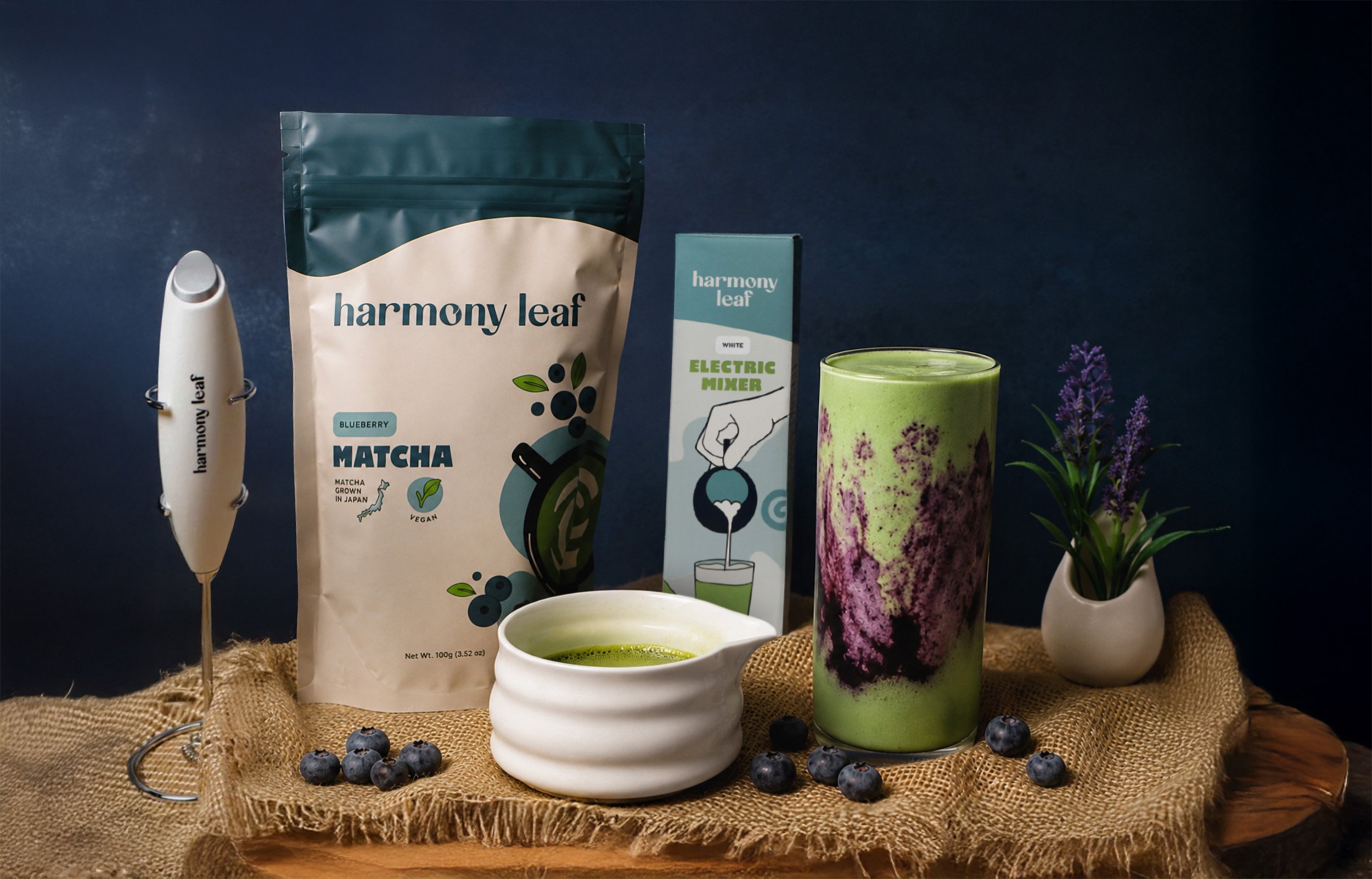
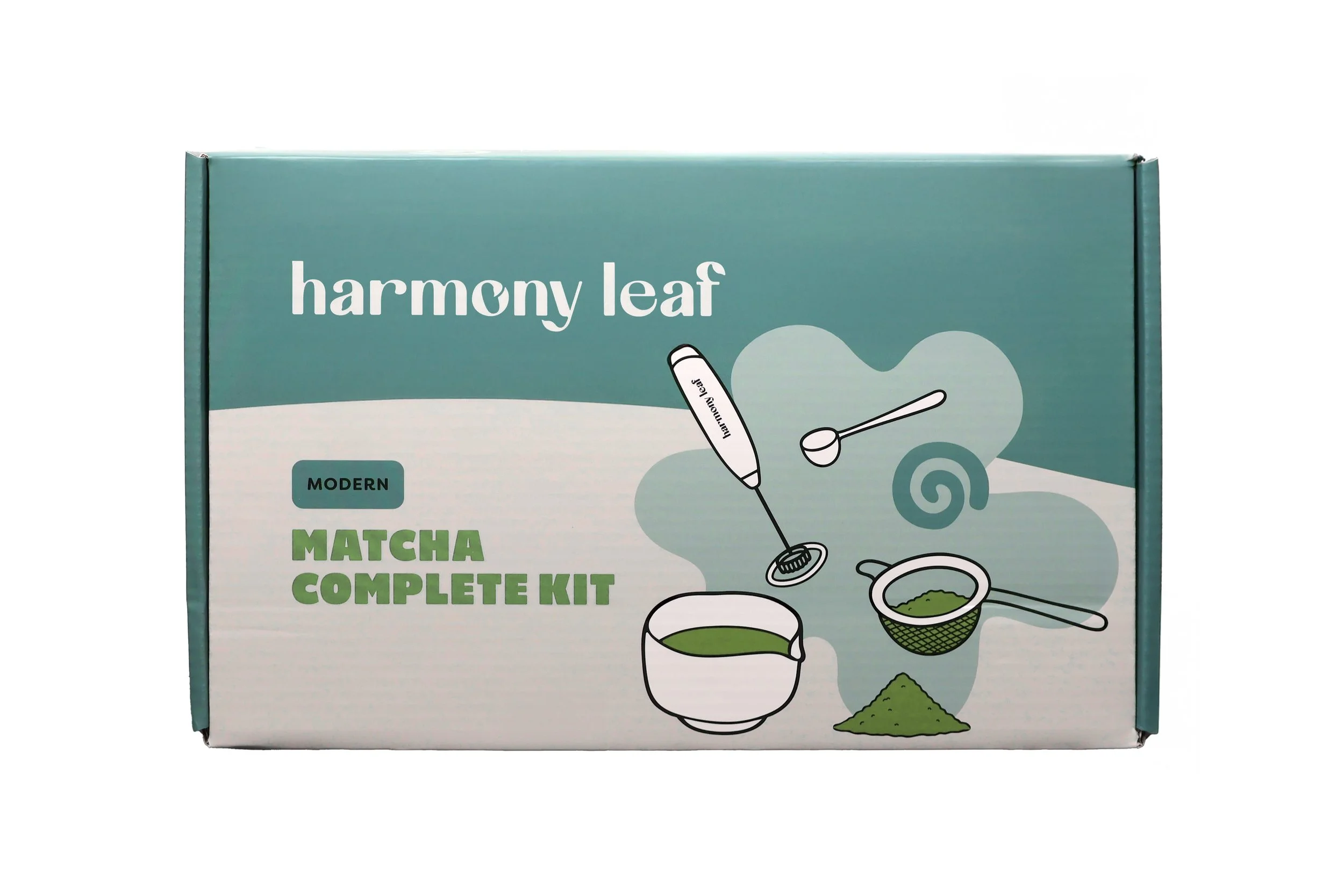
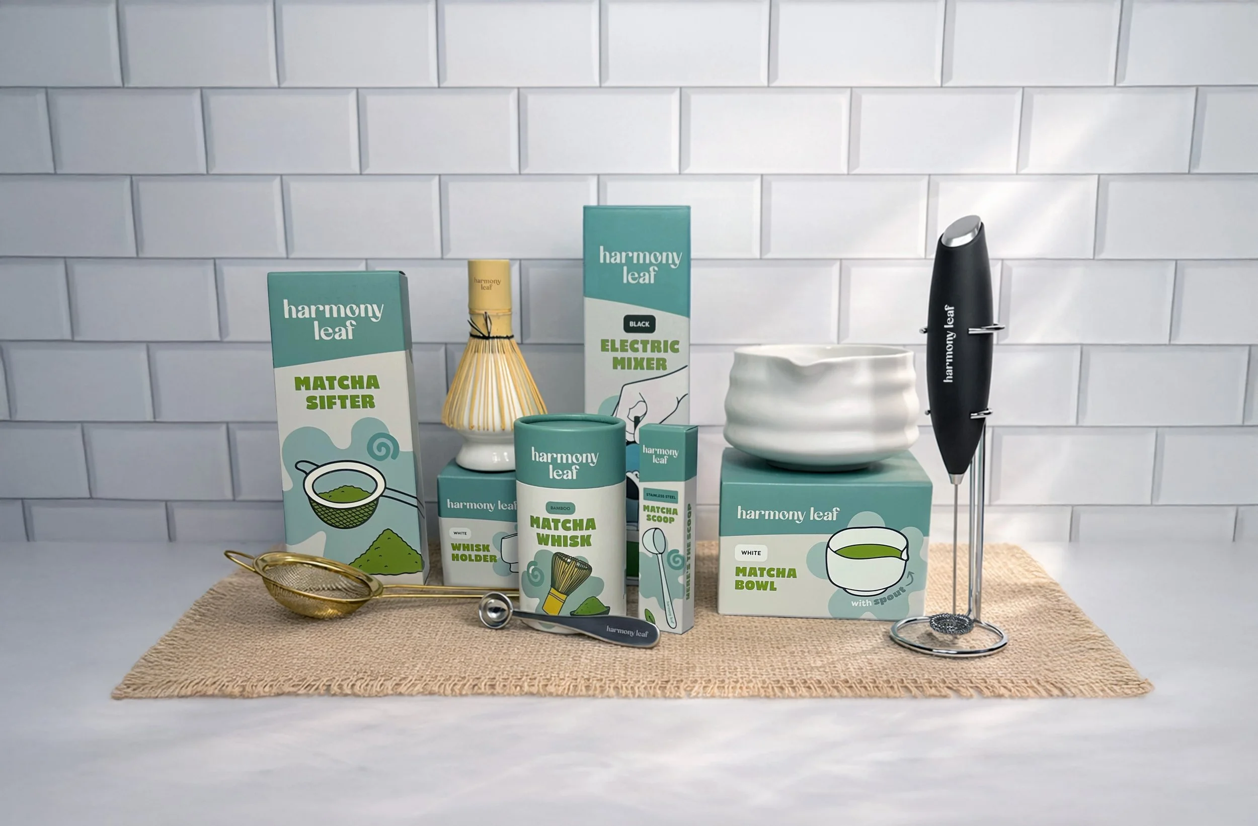
Harmony Leaf already had an established look for its matcha products, but as the product line expanded into mixers, bowls, whisks, storage, and other accessories, they needed that identity to carry consistently across an increasingly diverse catalog.
Our Solution
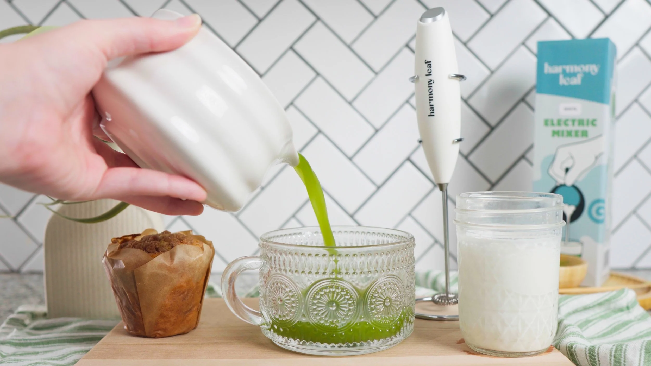
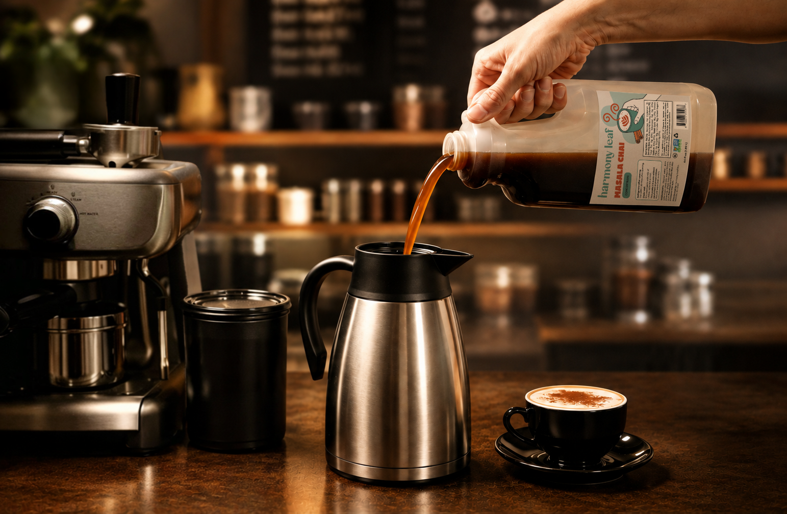
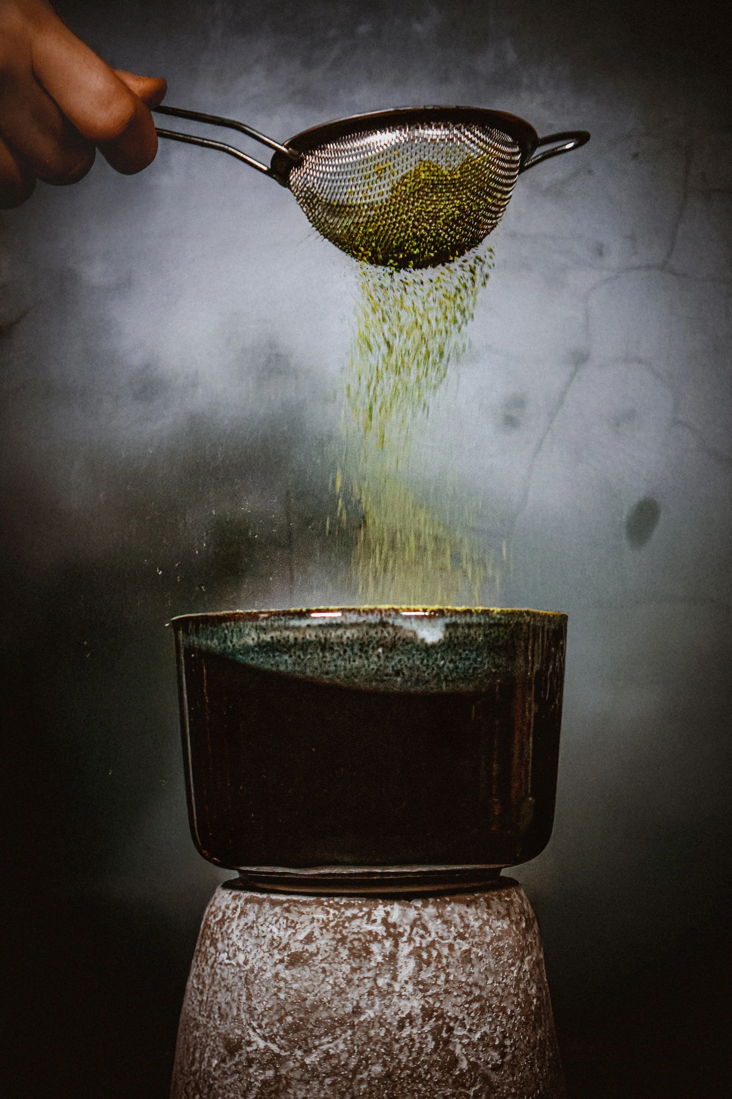
We expanded Harmony Leaf’s existing visual direction across its growing product line, designing packaging for new products and creating product photography built for e-commerce.
Each new piece was designed to feel like part of the same family—while still giving individual products enough personality to stand on their own.
The Results
Harmony Leaf now has a cohesive visual system that stretches far beyond its original matcha products, creating a more consistent presence across its Amazon catalog.